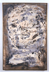
Title: Head XXIII
Media: Oil and lacquer on canvas
Size: 56 5/16x42 7/16x3/4in.
In 1956-57, Golub Lived in Italy, where he studied ancient Roman sculpture. He subsequently produced a series of Head paintings (three of which are in the MCA's Permanent Collection). These Heads are not portraits in the conventional sense, since no particular individual is featured. Although it does not precisely describe the person's appearance or state of mind, this larger than life-size head, through its frontal and central positioning. Confronts the viewer directly. Golub was inspired by the colossal sculptural fragments of bygone emperors that he studied in Rome. He has said about these figures: ``These Colossi are stoic, brute, and raw-looking eroded, massive in their sensef of self .. They stand up to time psychically and through erosion.`` Gloub's choice of earth tones complements the uneven surface of the painting, suggesting that the figure has survied time's trials. Like numerour works he created during the 1050s, including the MCA's Recling Youth(1959), the artist achieved this effect by building up layers of lacuqer and oil painit, thenm scraping it down to produce an uneven surface. Gloub also used slovents to erode the surface, giving the head an appearance that is both weather and timeless.
Related
sources
Books
Marzorati, Gerald. A Painter of Darkeness. Leon Gloub and our Times. New
York: Penquin Books, 1992.
Selz, Peter. New Inages of Man. Exhibition catalogue. Garden City, New
York: Doubleday, 1959
Video
Leon Golub. 40 minutes. Prodeced by Horsefield and Blumenthal. 1977.
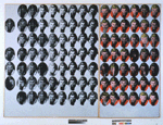
Title: Troy Diptych, 1962
Media: Silk-Screen ink on synthetic Polymer paint on canvas
Size: 56 5/16x42 7/16x3/4in.
This painting depicts Troy Donahue,
a popular B-movie actor of the late 1950s and early 1960s, in a format
that recalls the silk screen, a printing process favored by the artist.
According to Warhol: ``With silk-screening, you pick a photograph, blow
it up, transfer it in glue onto silk and then roll in k across so thin
ink goes through the silk but not through the glue. That way you get the
same image, slightly different each time. `` Although Troy Diptych is
a painting rather than a silk screen, Warhol refers to that medium to
achieve the effect of multiple images with minute but discernible variations.
Warhol liked to depict his subjects
in multiple form, whether they were Campbell's soup cans or celebrities
of the day. By reproducing the faces of celebrities over and over again
in a single artwork, Warhol may be alluding to the packaging of movie
stars. Here he varies the composition by presenting one portion in color,
the other in black and white, thereby echoing the formats of various fan
magazines and newspapers. The artist derived the two-panel, or diptych
format, from religious paintings; he may have chosen it as a commentary
on the reverence with which we treat our pop icons. Warhol's view on the
fleeting nature of celebrity was summed up in his dicturm that ``in the
future everybody will be world famous for fifteen minutes. `` *
Related
sources
Books
Bourdon, David. Warhol New York: Harry N. Abrams, 1989.
McShine, Kynaston, ed. Andy Warhol: A Retrospective.
Smith, Patirck S. Andy Warhol's Art and Films. Ann Arbor, Michigna: UMI
Research Press, 1986.
Video
Andy Warhol RM Associates, 78 minutes.
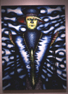
Title: Adria, 1776
Media: Oil on canvas
Size: 96x74in.
Adria
depicts the Chicago art critic and collector Dennis Adrian. Paschke decided
that he wanted to paint a portrait of him, so he invited him over and
took photographs. Paschke obviously chose not to reproduce the appearance
of the photograph, since the arms have been eliminated and the face appears
tattooed. The artist said of this work: ``At the time I was doing this
series of paintings, I was very interested in fashion, clothing, in how
people present themselves to each other... and in particular the play
of light on surfaces and one type of material against another.
`` Paschke's painting consists of
very strong colors. The artist recalled that some of his lasting childhood
memories consisted of circus visits and Fourth of July fireworks. In particular,
he likes the association between color and emotion.
Related Sources
Books
Ed Paschke: Selected Works 1967-1981
The Renaissance Society at the Univeristy of Chicago, Chicago:1982 Benezra,
Neal, Ed Paschke. New York: Hudson Hills, 1990 ]Garden City, New York:
Doubleday, 1959
Video
Leon Golub. 40 minutes. Prodeced by Horsefield and Blumenthal. 1977
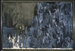
Title: In Memory of My Feelings , 1961
Media: Oil on canvas with objects
Size: 40x60x1 1/2in.
``In
Memory of My Feelings`` is the title of a poem by Johns's friend Frank
O'Hara, a poet and also curator of the Museum of Modern Art in New York.
The poem referred to O'Hara's recently ended relationship with painter
Grace Hartigan. Johns, too, had recently ended a love affair. In this
light, both the title and the painting seem more comprehensible. Johns
created a work that memorialized his feelings within a tribute to O'Hara's
poem.
On one side we see a single surface covered
with energetic brushstrokes in a range of grays and browns, with occasional
brighter tones of blue and orange. Does this half of the painting seem
sad? Happy? On the right a spoon and a fork hang together against the
broadly brushed canvas. The two halves are connected by actual hinges.
This work emphases, couples, or twos. The
painting is split in two halves by two hinges, and then the lfet side
in split in half again. There are two utensils hanging from a string that
is duplicated by its own shadow. The spoon and fork, which call to mind
a household, eating, and the intimacy of sharing a home with someone,
hang together directly in front of the spilt between the boards. Perhaps
Johns compares the superficial, forced joining of two people (the single
surface of paint) with the actuality-two people split apart, perhaps with
different and uncontrollable emotions. Perhaps the spoon and fork symbolize
Johns and O'Hara, similarly two artists but in different mediums, both
hanging in front of this split (the break-up) in each of their lives.
These are only ideas, suggested by images Johns actually used in his painting.
Many contemporary art works do not specifically tell a story. Instead,
by similarities and differences, by what artists include and what they
omit, they suggest impression feelings, and ideas that invite the viewer
to speculate and relate to their won individual experiences.
Related
sources
Books
Francis, Richard. Jasper Johns. New York: Abbeville Press, 1984. O'Hara,
Frank.
The Selected Poems of Frank O'Hara. New York: Alfred A. Knopf, 1950 Rosenthal,
Mark. Jasper Hohns: Work Sinces 1974 Philadelphia: Philadelphid Museum
of Art, 1988. Fil, Jasper Johns: Take an Objects. Hans Namuth and Judith
Wechsler, 1990.
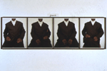
Title: She, 1992
Media: Color Polaroids and Plastic plaque
Size: 25x85 1/4 in.
Wearing
a brown suit and a white-buttoned shirt, the subject of Simpson's photos
sits facing forward in a chair as if at an interview. The sequential format
of the work, in which a series of four photographs captures a slight shift
in her position each time, implies that she's been caught self-consciously
in freeze-frame. Simpson cropped the image so that we can only see between
the lips and the knees of the figure.
Simpson has said that black women in the
U.S. are treated by society as if they're faceless, without identity or
individuality. By not showing the faces of her models, Simpson reminds
us of this treatment. Her figures become universal, and the camera lens
can focus on other aspects of the body, such as clothing and posture.
The typically masculine clothing and the relaxed, quite unladylike pose
of the woman in She belie the title ``female`` in lower-case italic script
above her like a scientific label. Simpson often used the discrepancy
between text and image to emphasize stereotypical conclusions many people
draw expecially about women/s place ``in society. Can ``she`` wear a suit
and still be a woman?
Related
sources
Books
Wright, Beryl. Lorna Simpson: For the Skae of the Viewer. New York: Univerisie
Publishers, 1992.

Title: Boite-en-Valise (Box-in-Suitcase), 1941-/63
Media: Miniature replicas and black-and-white/color reproductions of works by Marcel Duchamp in Cardboard box
Size: (Open) 15 11/16x 14 15/16x34/3/4in.
Duchmap's
Box-in-Suitcase consists of 68 reproduction of his own artworks, contained
within a cardboard box which, when fully opened serves as a miniature
museum of Duchamp's artistic output. On one level, then, Duchamp's Box
serves a portable retrospective of his artistic achievement. With this
work, Duchamp marked a division between one part of his life that was
finished and his future.
Box-in-Suitcase suggests other meanings
related to Duchamp's particular artistic aims. Included in the box are
several of his infamous readymades, including Fountain (mentioned above),
Bicycle Wheel, and Bottle Rack. These works are precisely what their titles
indicate-ordinary manufactured objects that Duchampselect4d and exhibited
as art. By calling these objects ar5t, Duchamp suggested that anything
could be art if the artist so named it, thus questioning a centuries old
ides: that artistic quality is based on craftsmanship and originality.
If an ordinary bicycle wheel could be mounted on a stool and exhibited
as an artwork, all pr3vious artistic standards seem to have been je3ttisoned.
Duchamp has been among the most influential artist of the twentieth century
for his practice of liberating art-making form long-held rules and habits.
Related
Sources
Books
The Duchamp Effect. Duchmap, Marcel. Salt Seller; The Writings of Marcel
Duchamp.
Video
Marcel Duchamp: A Games of Ches, RM Arts. 58 min.
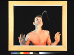
Title: Self-Portrait as a Fountain, 1966-67
Media: Chromogenic color print
Size: 19 11/16x23 5/8 in
Self-portrait as a Fountain is part of a series of photographs in which Nauman is acting out several different word phrases. Here we are presented with the ``artist as fountain.`` In this particular photograph Nauman's biting sense of humor is immediately apparent. Nauman seems to be poking fun at the pedestal is some artists are put on or put themselves upon and the reverence with which they are often treated. He seems to be commenting on the notion that whatever an artist calls art is art, and in this case he says that a photograph of himself spitting water out of his mouth is a work of art and that his is a fountain. Of this approach Nauman has said, `` My conclusion was that (if) I was in the studio, then whatever I was doing in the studio must be art ``This photograph also includes and element of performance. First, Nauman performed an action for this photograph and documented the finite action through this medium. Second, the artist arranged harsh light s coming from the floor that seem to be shining up at him like stage lights, further enhancing the idea that this was a performance.
Related
sources
Books
Bruce Nauman: Prints 1970-89. New York, Castelli Graphics, 1989. Bruce
nauman. London:Whitechapel Art Gallery, 1986.
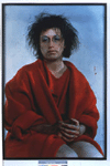
Title: Untitled #137, 1984
Media: Chromogenic color print photography
Size: 70x 1/2x47 3/4 in.
Sherman
allows and even encourages viewers to construct stories for her pictures.
In Untitled #137, she positioned herself centrally and frontally to command
the spectator's attention. Her red clothing also draws our eyes to the
figure. Yet, she averts her gaze, leaving us to speculate on her mood
and sated of mind. To open up the possibilities Sherman kept the photograph's
background undefined, and posed in nondescript clothing. Observing that
the woman's hair is in disarray and that her hands are dirtied, we begin
to wonder why she is disheveled. Sherman has revealed many, but not all,
of the pieces of the story, prompting us to look carefully for clues as
we create our won narrative.
In her photographs, Sherman always features
herself; yet she continually alters her appearance, roles, and mood so
that no two images look the same. Through these photographs, she may be
commenting on women's capacity (and perhaps their obligation) to transform
themselves in order to meet society's expectation.
Related
sources
Books
Krauss, Rosalind, Cindy Sherman: 1975-1993. Rizzoli International Publishers,
New York: 1993 Cindy Sherman. Pantheon books, New York: 1984
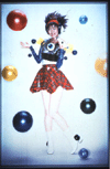
Title: Birth of a Star, 1995
Media: Duratran, acrylic, and light box
Size: 72x48 in.
This
photograph shows a young Japanese woman who does not appear quite real;
although the photograph has a three-dimensional quality because it is
made of Duratran, the figure has phony eyeballs and plastic covering her
legs. She wears suggestive schoolgirl clothes, and has glossy, smiling
lips, maniacal eyes, and flyaway purple hair. Does she look happy? Does
she look intelligent? Does she look playful? Does she look like a capable
adult?
Mori implicitly questions the rules of a
society where women are expected to be pretty, happy, and mindless. Although
Japanese society has changed dramatically in the past fifty years, women
still remain outside of the male-dominated power structure. As a former
model who says she went through an identity crisis as a result of her
participation in the fast-paces fashion world, Mori also makes a state4ment
about fashion, modeling, Models are the epitome of the female stereotype-alluring
and smiling or pouting and silent. Their primary function is to sell products:
perfume, cars, cigarettes, or a particular look or lifestyle. This figure
might be modeling her bracelets or her headset, or perhaps her clothes.
The title Birth of a Star emphasizes an aura of glamour in the work already
suggested by bright, glowing colors, shiny plastic, and a larger-than-life
figure. The tuneless, high-voiced musical accompaniment implies she might
be a rock star. Whatever the figure represents, Mori ironically points
out the absurdities of Woman's stereotypes by using the same glossy look
that fashion magazines employ, but toward a different end.
Related
Sources
Articles
Blair, Dike ``Mariko Mori.`` Flash Art No. 189 (Summer 1996) : 131.
Corris, M. British? Young? Invisible? With Attitute?'' Artforum vol. 30.
P111, May 1992.
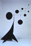
Title: performing seal, 1950
Media: Painted sheet metal and steel wire
Size; 33x23x36 in.
While
not big, brown, and wet, Calder's stabile Performing Seal looks like a
circus seal balancing a ball on its nowe. The shapes of the seal's body
and flippers are simplified into abstract forms that nevertheless create
the idea of a seal. The structure of the delicately balanced discs and
wires allow the seal to dance and bob with the slightest breath of air,
recalling the motion of a seal performing tricks.
The monochrome (one color) nature
of this work allows the viewer to focus on its shape, volume, and movement.
Calder loved to give his artworks actual, physical motion, and he insisted
that such works were not sculptures, but stabiles or mobiles (hanging
from the ceiling). Caller said, ``Above all, art should be fun. `` He
was fascinated by animals and especially by the circus. His works allocation
a; sense of whimsy and delight-in his simple forms, charming curves, and
bright, basic colors-as well as in his humorous ideas and subjects.
Related
Sources
Books
Lipman, Jean. Calder's Universe. Philadelphia: Running press, 1976.
Mater, Joan. Alexander Calder. New York; Cambridge University press, 1993.
Video
Mobile: By Alexander Calder. National Gallery of Art. 25 min.